

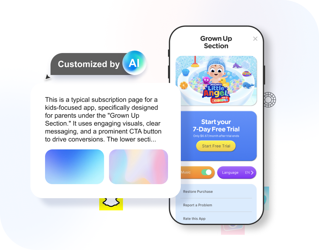
The Ultimate Paywall Intelligence Platform
Access  paywall screenshots and get personalized subscription strategy insights.
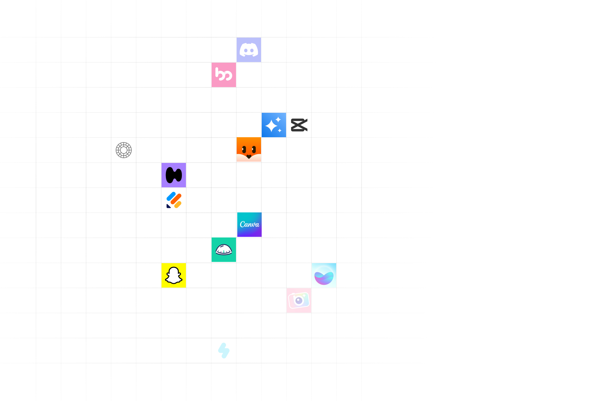
Explore 2,000+ iOS app subscription models with real paywall screenshots and data
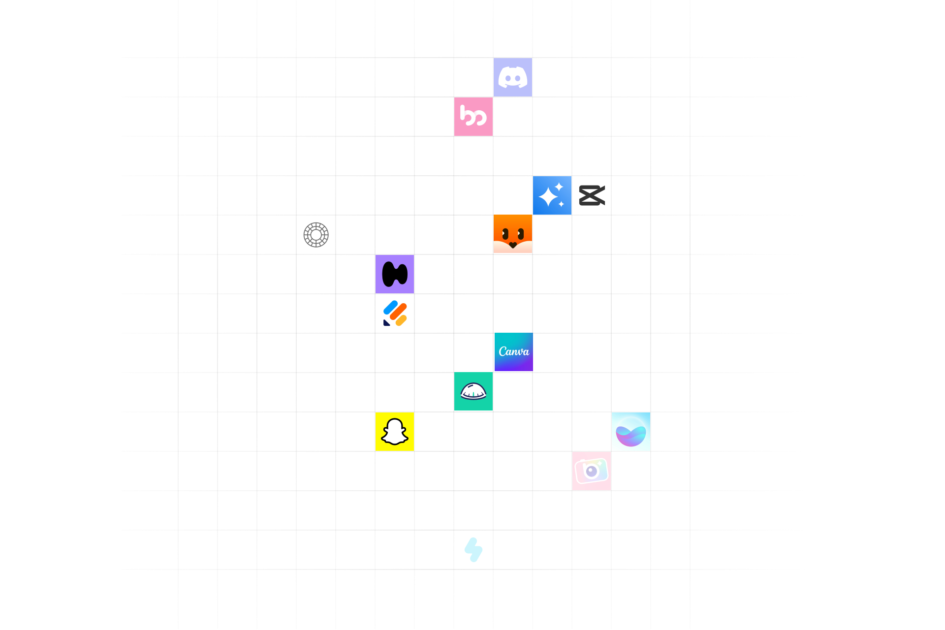
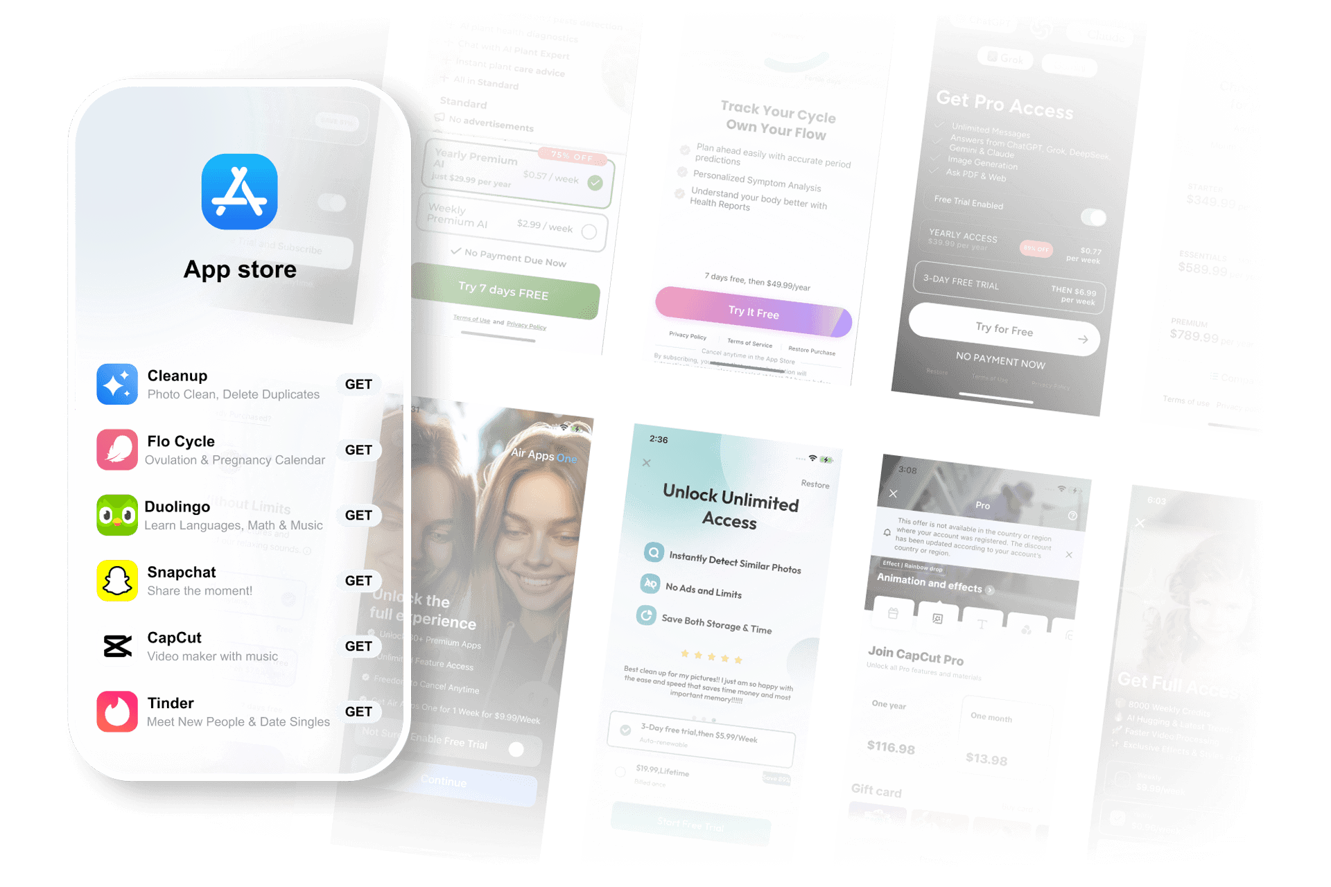
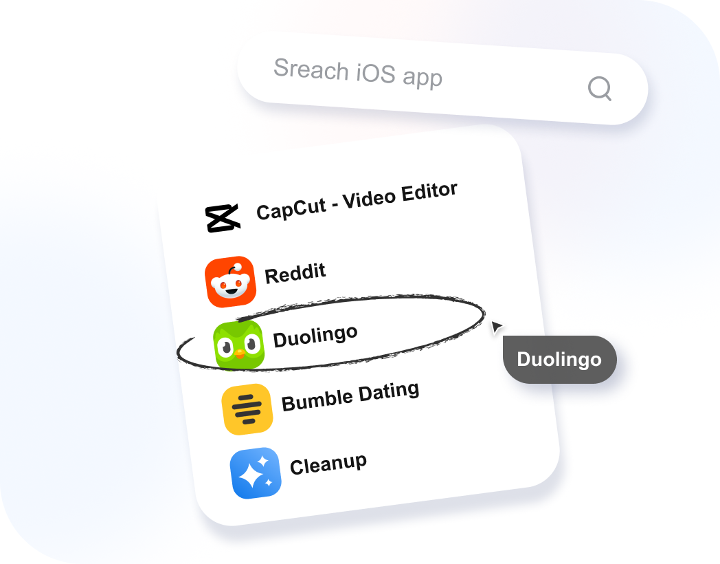
 ChatGPT
  Cleanup
  Duolingo
  CapCut
  Tinder
  Flo
Flo A constantly growing intelligence library of over 0+ subscription apps
0+
Tracked Apps
In the past year, 0 apps have updated paywalls more than 3 times
0
Paywall Screenshots Collected
1,613 apps achieved subscription growth after UI updates
0
Onboarding Flow Videos
350+ Paywall Screenshots Updated Weekly
Why Choose PaywallPro?
Explore paywalls from over 10,000 real apps
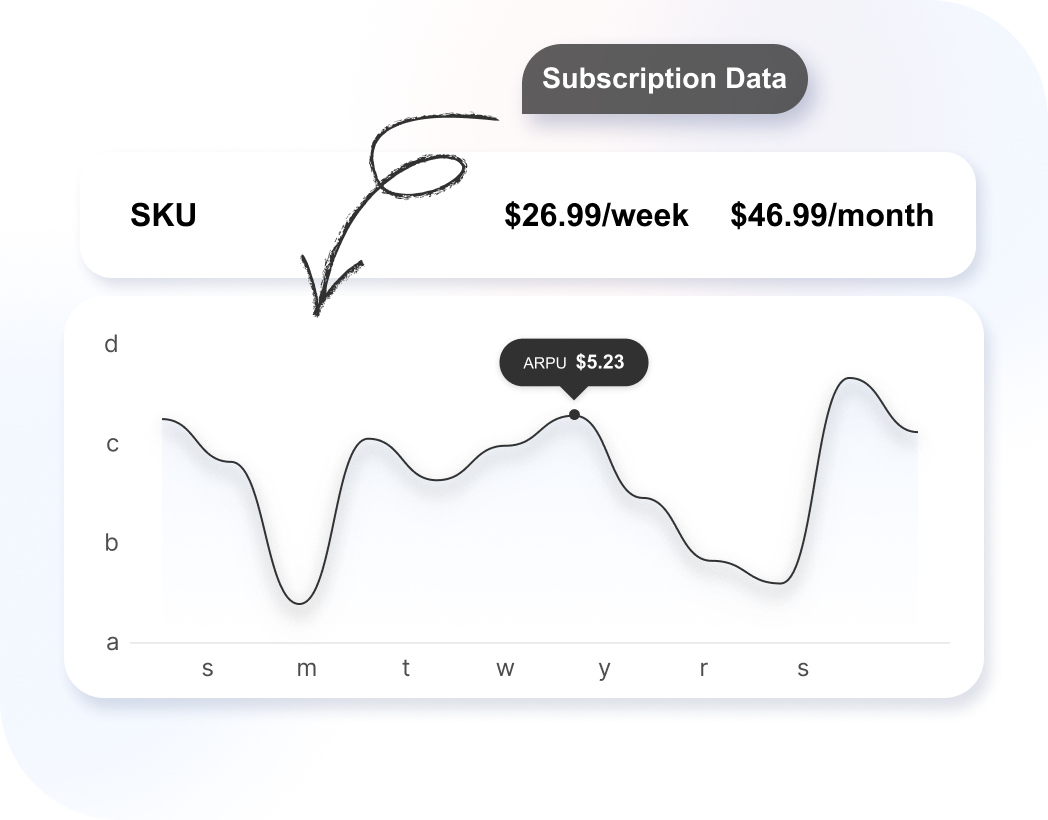
Track paywall evolution, including historical versions and A/B test variants
Gain AI-driven insights on pricing, UI, and trial strategies
Tailored for iOS subscription-based apps
How Does PaywallPro Work?
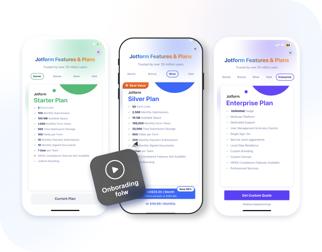
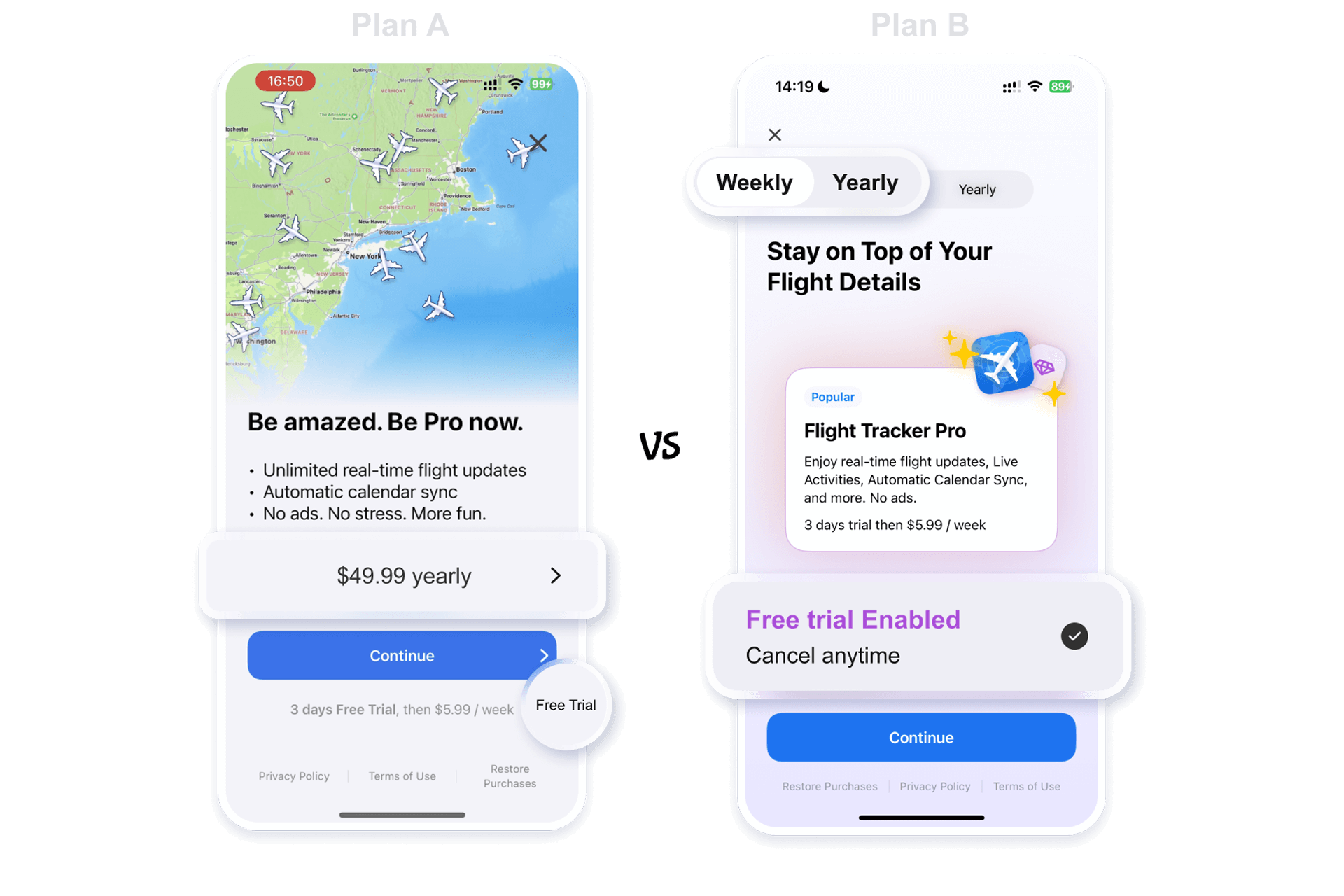
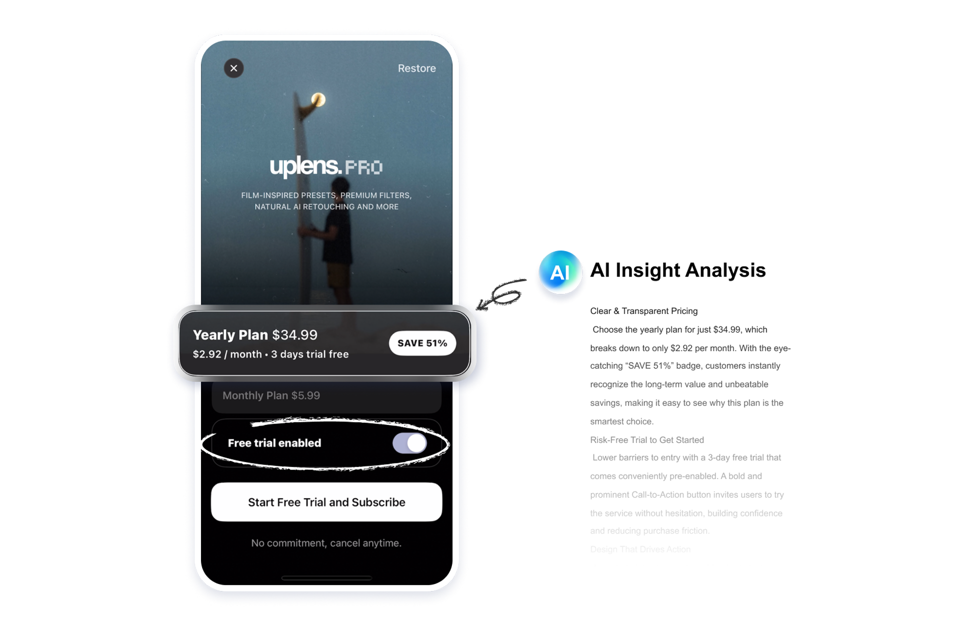
Popular Onboarding Flows & Paywall Screenshots
Real Customer Cases
View All
PaywallPro Help Center
Frequently Asked Questions (FAQ)

PaywallPro Glossary

Contributor Program
PaywallPro Blog
Pricing
Frequently Asked Questions

Ready to optimize your app’s subscription revenue?
Access iOS paywall screenshots and get personalized subscription strategy insights.

